Application

Leergo. Practice your Dutch, on the go.

November 2017 - August 2018

Problem statement

Designing a new language learning platform

The client currently offers a website which allows users to practice with one aspect of the Dutch language. This however, is limiting for learners and might not satisfy users who want to practice with more than one language element. In this sense the existing platform was inefficient and limited. The client wanted to improve on this by developing a new way for users to practice their Dutch. The newly designed language learning platform, Leergo, allows users to practice with every aspect of the Dutch language. The question of how to create such a pleasant learning environment for users, which would allow them to practice Dutch in an efficient and motivating way, was the biggest design challenge for this project.

Using an evaluative and iterative design cycle, in which I did multiple rounds of researching and evaluating, allowed me to design a well-tested and by research supported product.

I worked on the application as a solo design project. I researched, tested, and designed the new application during my graduation period.

Problem exploration

User analysis

In order to steer the project in the right direction I questioned active users of the current platform. Figuring out their opinions, pain points, and desires was important for the direction of the project. Through the use of an online survey I questioned over 90 users regarding their experiences with the existing platform and learning platforms in general. Amongst others, users were also asked about their nationality, desired learning features, and expectations. They were also asked to fill in the System Usability Scale (SUS), which allows for quick usability testing of a platform. This led to interesting results. The key results are listed below.

Users think several factors are important in learning platforms: visible progress, exercises with explanation, levels, interaction with other users (social elements), and user friendliness

Users expect multiple things of a new platform: more exercises and possibilities, practicing at higher levels, personal feedback and the platform has to be used with ease, be quick to use and finally has to be well-structured.

Users' opinions and desires

Key survey results

0 %
Dutch or Belgian Nationality
0 %
Higher educated
0 %
Female

Preliminary research​

Opportunity exploration​

Key concepts
Based on the problem description several key concepts were defined. These key concepts would be researched in depth so that they can be effectively applied in the application. The key concepts were e-learning, mobile usability, and gamification.

E-learning, mobile usability, and gamification would be the main research topics.

Key concepts

Competition analysis
Several possible competitors of the new platform were also analysed. These included both Dutch and international platforms. Several platforms successfully applied functionalities and/or theories, such as gamification and several design trends. Others were less successful in applying those theories, even though they applied plenty of learning information. This information however, was sometimes confusing to look through. These factors were something that could be taken into account whilst developing the new learning platform.

Trends & developments
After determining the key concepts I looked into the current developments surrounding them. Knowing about the current theories, trends, and developments surrounding the key concepts was important for the further development. This analysis led to several important insights. The important factors and insights are listed here.

Adaptivity, mobile learning, micro learning, social learning and gamification were important factors to consider. Minimalism, onboarding & offboarding, and the use of colours & gradients were also of importance.

Important insights

Main research

Literature research

After the exploration phase I delved into literature to research the three key concepts. During the research it was about gathering information from published (scientific) articles and news regarding the topics. This brought up to date definitions, requirements and clarifications to my knowledge. This research was a key step for the further development of the project.

E-learning works. E-learning encourages students more and improves learning by 20% to 30%.

Students must be involved in learning; they must be motivated.

Social feeling is often lacking. Creating a community is important.

Goals help students retain interest and increase motivation.

Personal, motivational feedback is important and increases motivation.

E-learning - key outcomes

Simplicity and interactivity are two important factors for creating good mobile usability.

The ability to adapt the system to and by the user is important for creating the most user-friendly experience.

Receiving useful feedback is also essential for users.

Finally, having good mobile usability leads to a strong brand loyalty and ultimately, trust.

New, smartphone aimed heuristics (SMASH) are optimised for mobile.

Mobile usability - key outcomes

Gamification can lead to an improved dedication of energy and motivation, elements that are important for successful learning.

Some game elements lend themselves particularly well, these are elements such as a badges leaderboards, and teammates.

Applying gamification we can encourage the intrinsic motivation of users, which will benefit their learning.

Creating relevant learning goals are very important: goals that lead to learning information increases the users' time spend learning.

Gamification - key outcomes

Ideation

Starting off

After formulating the design requirements the first steps towards shaping up the application were taken. The ideation phase kicked off by making personas, having a brainstorm session with the client and users, affinity mapping the results and creating sketches based on the results.

Ideation

Personas

Based on the results of the user surveys I put together two personas which represented the vast majority of the users. These personas were the basis for the further design process, and consisted of personal details, goals, satisfactions, and finally their frustrations.

Ideation

Brainstorming

After creating the personas I set out to brainstorm the initial ideas and concepts for the product. I organised a brainstorm session for which I involved the client and a possible user of the platform. The user was international and matched well with one of the personas. Incorporating the ideas of both the client and the end user delivered a large variety of ideas and concepts.

Sorting ideas

Affinity mapping & sketching

Due to the large amount of ideas generated throughout the brainstorm session I set out to bring some order in the list of ideas. I did this through the use of the affinity mapping technique. By clustering ideas, grouping them and removing doubles and merging similarities a well organised list of concepts was put together.

After organising the ideas I started to quickly sketch out some of the ideas. This gave me a more clear vision of the possibilities of some ideas, while it also filtered out the less usable ideas. Some of these sketches formed the initial ideas for further concept development.

Specifying

Defining one concept

Following up the development of loose ideas it was time to further converge the ideas into some concrete concepts. This was done in multiple steps. Firstly, the ideas were individually compared to the design requirements. This determined which ideas were viable and which weren’t. The concepts that evolved from the step were rapidly evaluated with the client, in which he provided me with his vision on the current state of the concepts.

Merging and prioritising ideas
After the evaluation the ideas were prioritised and merged into the final concept. This round of prioritising was done using the MoSCoW method. This method allows the concepts to be divided up into parts. The must have ideas are important to implemented and are must-haves to allow the product to work properly. Next up are the should have ideas. These are important, but are less critical for the functionality than the ideas in the first categorie. These were followed up by ideas who were not as important, but could be implemented if the additional time is available, and lastly by ideas which wouldn’t be implemented within the current design cycle. This entire process led to the formulation of one final concept, based on the all of the previous stages in the design cycle.

Final concept and design specifications
After creating the definitive concept I created the design specifications. These specifications were a description of the functionalities for the final product, and were in turn based on the earlier made requirements.

Visualising ideas

Functions & flowchart

In order to envision the use of the product user stories and task scenarios were created. As these stories and scenarios were based on the personas they gave insight into several final uses for the product. This allowed me to place myself into the personas’ position and to determine the functionalities and required steps and screens. This ultimately led to the creation of several flowcharts, which described all the steps, screens and feedback the users would run into while navigating through the application. A brief part of the practice functionality is shown here.

Visualising

Visualising the concept

Mood boards, icons, fonts, and colours
After determine the final concept I moved on towards the visualising and prototype phase. I started off with designing a mood board to determine the desired look and feel. Based on this look and feel, plus the earlier research and  design specifications, I selected a collection of icons, fonts, and colours (shown below) for the prototype to use.

Prototyping

Low-fidelity prototypes

After determining the look and feel the next part of the project started, designing the application. The final concept and appropriate specifications were key to determining the functionality and look of the application, and would be the basis for the drawing of sketches. These various sketches formed the basis of the further process and were subsequently converted into a simplistic, first digital version: the low-fidelity prototype.


Example of changes before and after testing. The progress bar was further clarified and the description of the exercise made more prominent.

Expert review

Rapid evaluation

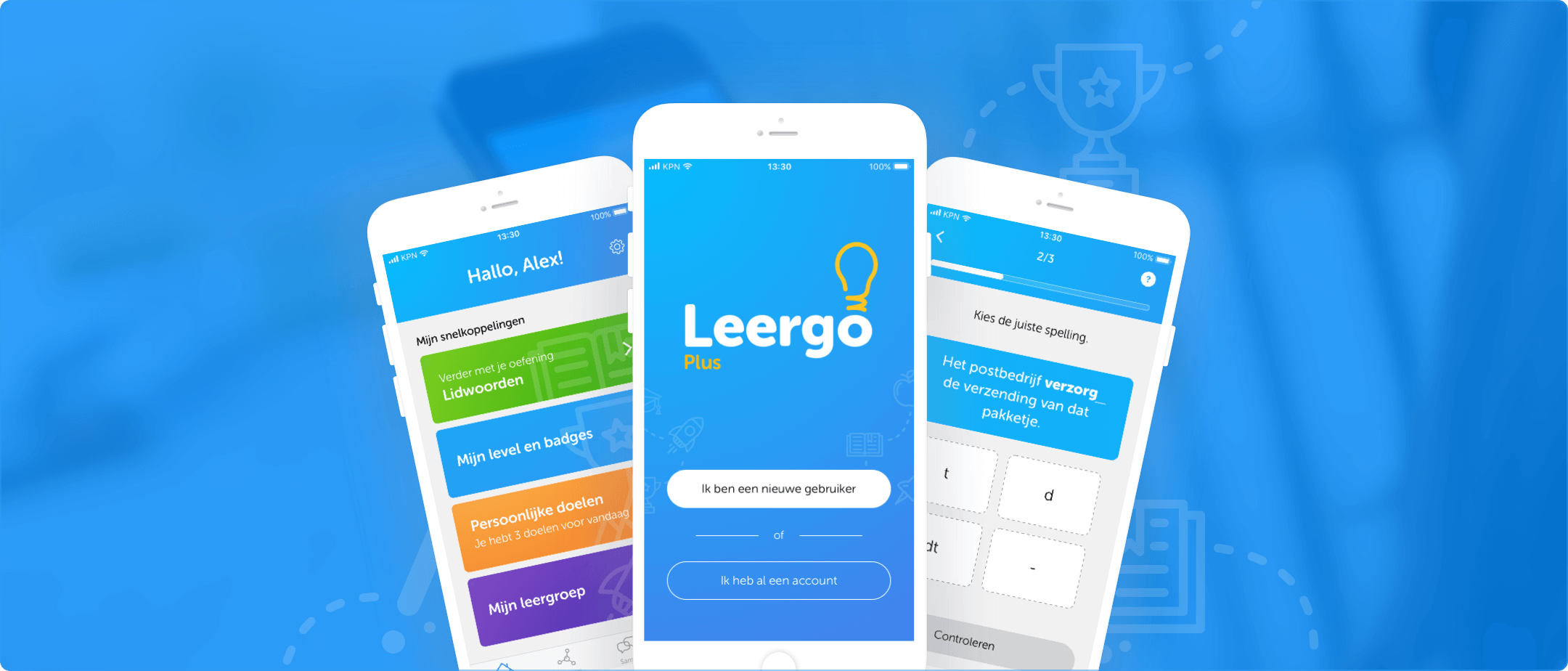
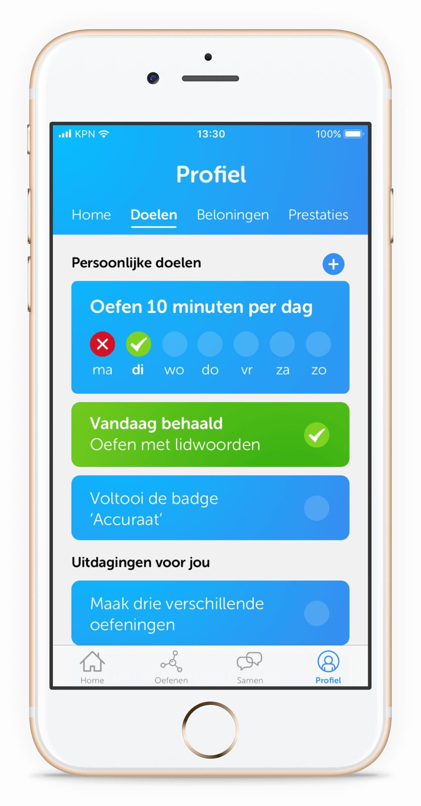
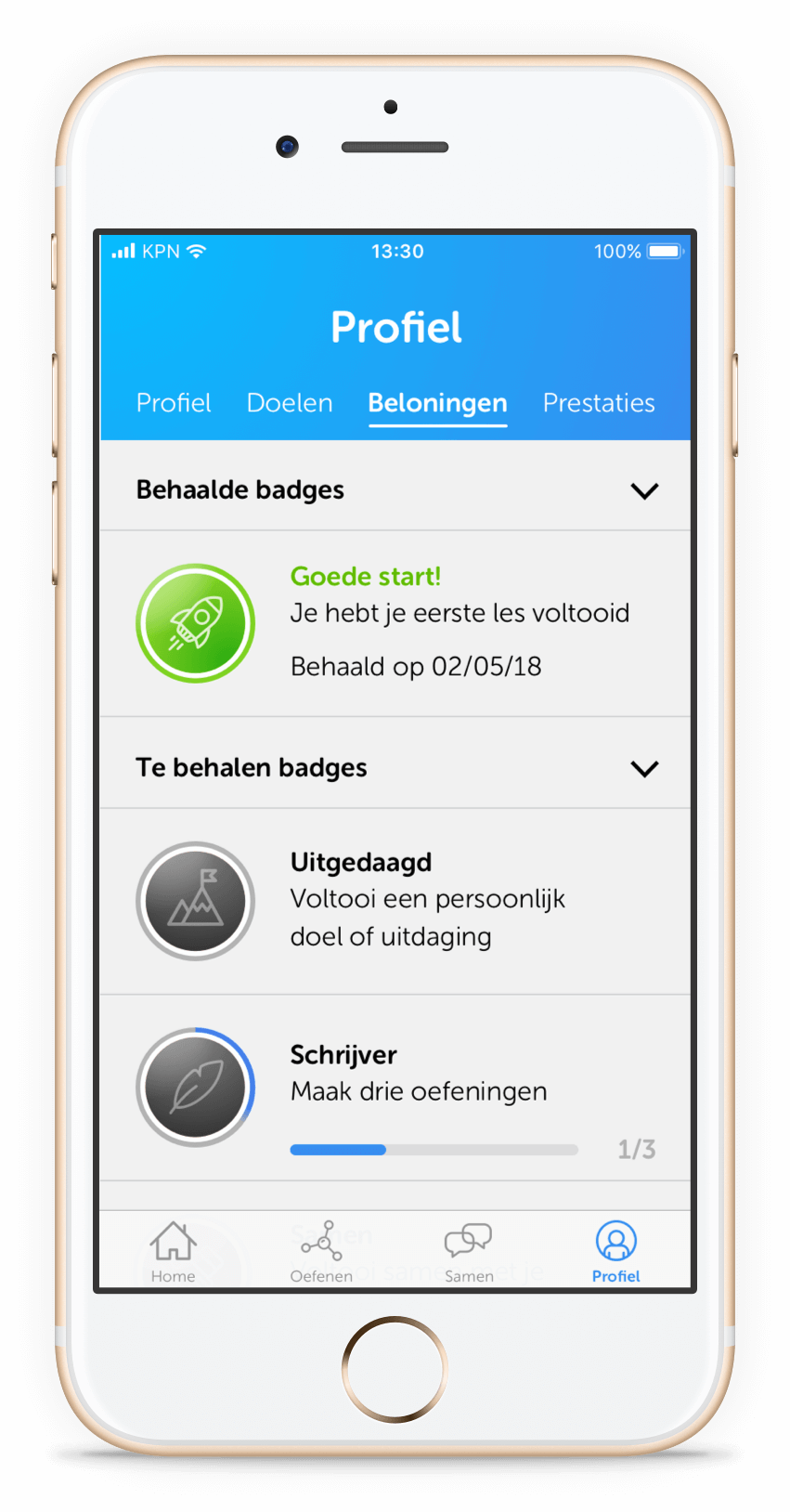
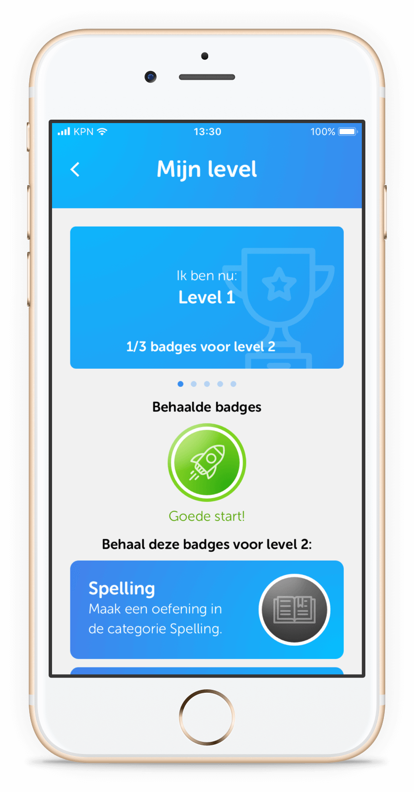
After developing the low-fidelity prototype I evaluated the product with a design expert, specialised in human-centred design. As a Human Centred Designer, the expert knew all about user experience, usability and the psychology behind designs. This was extremely applicable when testing the prototype. By working in this multidisciplinary way the problems could effectively be found within the prototype and quickly fixed.

This test was primarily done to discover usability problems within the prototype, as well as to understand the general impressions the prototype created. A number of tasks were drawn up before testing. These tasks were set up in such a way that the user would pass every part of the application, in order to gather as much input as possible about the state of the prototype.

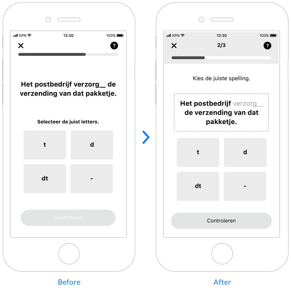
The test brought some clear problems to light. A couple of aspects were unclear, such as where to click to reach a next screen. Another aspect that came to light was the difficulty of the language used, some terms might be too confusing for the final target group. Bringing these issues to light was an important part of the development process, and ultimately led to creating a better high-fidelity prototype.

High-fidelity prototype

Designing the application

The final high-fidelity prototype is designed on the basis of the visualisation results, concepts, design requirements and design specifications that have been drawn up previously. By consciously taking all the set requirements into account, the intended usability of the language learning platform can be guaranteed. The basis of the high-fidelity prototype lies with the earlier designed low-fidelity prototype. For this a second version of the low-fidelity prototype was used, which had been modified to include the feedback from the expert review. In short, the high-fidelity prototype is built on top of the tested prototype, which in turn benefited the usability and experience. 

Visual design

Key functionalities

Onboarding

First time onboarding

Onboarding

Introduction to exercises

Onboarding

Personalising the application

Visual design

Dashboard & exercises

Learning together

Learning groups

Encouraging learning

Profile, challenges & rewards

Showcase video

Function showcase

Evaluation

Testing with users

After designing the high-fidelity version the prototype was tested with end users. The test was performed using several methods. First and foremost I used task scenarios to let the users find their way through the application. I hereby also made use of the ‘think aloud’ method. Having users say their thoughts while performing the tasks allowed me to better understand their viewpoints. After going through several task scenarios I interviewed the users to hear more about their thoughts and opinions.

To what extent does the newly designed language learning platform provide users with a meaningful user experience?

Evaluation research question

The evaluation was held with a group of 10 users, with a mix of both Dutch and international nationalities. These users largely aligned with the created personas. Testing with a group of 5 users brings most of the usability issues to light. However, using a larger target group allowed me to get more detailed and varied results, useful for both the System Usability Scale test and Microsoft Desirability Toolkit.

Users involved with the evaluation

After interviewing the users I also went though questions related to the System Usability Scale, the quick test to measure the observed usability by users. Finally, I applied another method: the Microsoft Desirability Toolkit. The toolkit mainly measures the visual appearance of the user interface. To measure this the users were presented with a list of both positive and negative words. They were asked to list a top five of words they associated with the product. 

Key evaluation results

Suitability prototype
After evaluating with the target group it became clear that the usability of the prototype is in a good place. The System Usability Scale’s score of 84 is in the top 25% of all scores tested, and falls between good and excellent. 

The results of the evaluation show that the design works well and works in the right way. Apart from a small number of usability improvement points, the results correspond to the objectives that have been drawn up in advance. The platform offers an experience that can be described as user-friendly, enjoyable and motivating. The users described the language learning platform as attractive, motivating, fresh, clear, and finally accessible.

Users indicated that the application encouraged them and that they were motivated by the various functions that are integrated in the learning experience. Every user said they would use the application in its current state.

0
System Usability Score
0 /10
Users performed task scenarios flawless
0 %
Of users said the app motivates them